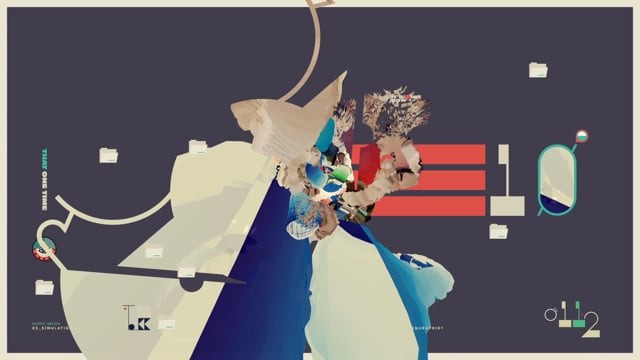
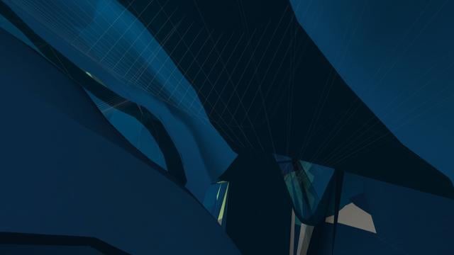
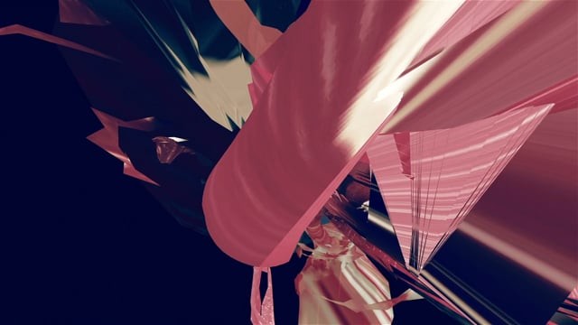
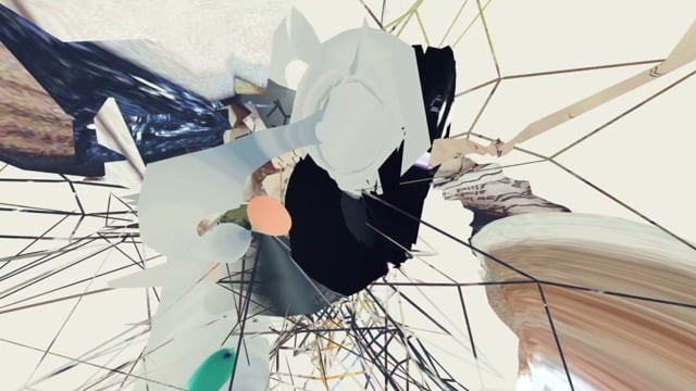
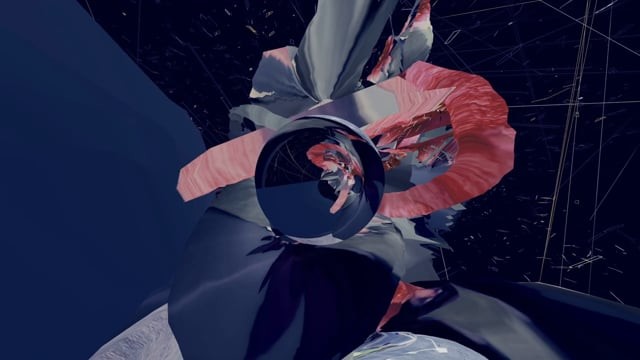
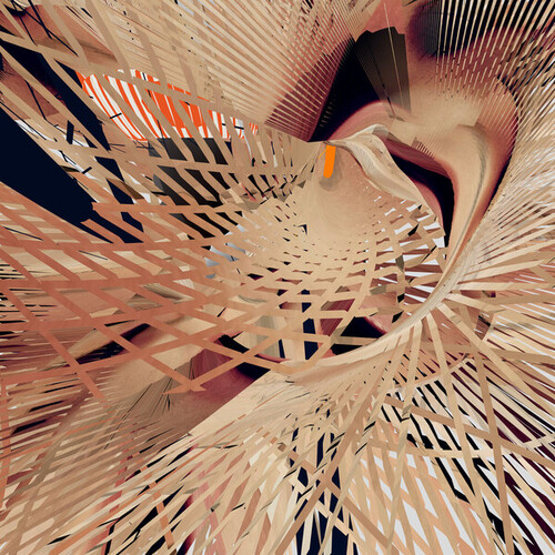
March in ThonburiMarch in Thonburi is an experimental short, created over two years by Michael Paul Young. After relocating from Baltimore to Bangkok, Thailand, in 2007, Young sought to expose how the many sensory influences of his adopted country have affected him. The result, March in Thonburi, embodies a rich sensory journey through an urban cultural atmosphere from the perspective of a stranger in a strange land.
The visual genesis was a series of still images posted by Young throughout the early part of 2008 on Flickr and his own websites. During the ensuing two years, as various 3D renders were created, and video and audio recordings were captured, March in Thonburi evolved into motion. As Young continually expanded the piece throughout 2008 and 2009, each clip branched out from the next, as he immersed himself in the sights, sounds and smells of Thonburi-the Bangkok neighborhood that housed his studio. The final edit was shaped during the last three months of 2009, within the chaos surrounding Young as he became the sole owner/officer of his company YouWorkForThem, while preparing to move their studio to more rural environs.
With the visual edit complete in January of 2010, Young sent the then-silent piece to long time collaborator Michael Madill of Madsound. Utilizing the raw audio elements that Young and his associates had recorded on the streets of Thonburi, Madsound evolved these field recordings into a narrative under Young’s direction, pushing and shoving the viewer through the confusing, intriguing, sometimes frightening sensory environment of March in Thonburi.
Creative Director: Michael Paul Young (http://www.michaelpaulyoung.com)
Lead Designer: Michael Paul Young
Assistant Designer: Jackkrit Anantakul
Editors: Michael Paul Young, Jackkrit Anantakul
Soundtrack: Madsound (http://www.madsound.org)2019-10-18 09:37:59 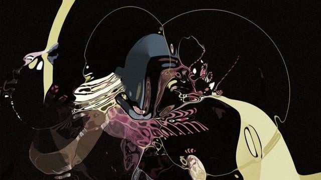

Operating SystemAbout a year ago (2014), I was asked to provide a design proposal to one of the world’s largest software companies, for their flagship product. While I’m precluded from telling you who it is, if you live on Earth, you’ve heard of them. It was a huge honor to even be asked to pitch, and of course a lot of things went through my head as I pondered how to best approach it.
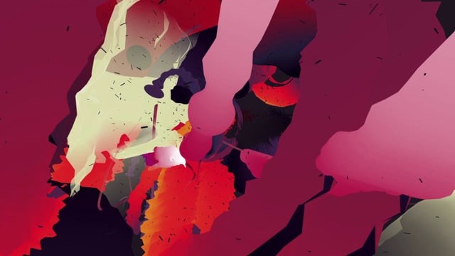
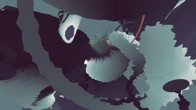
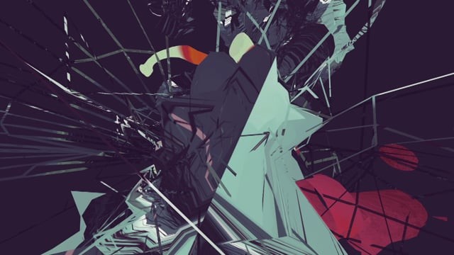
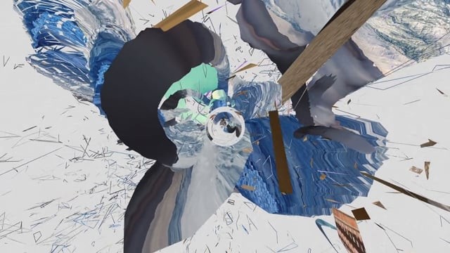
I felt strongly that, rather than doing anything that was preconceived or related to their existing brand, I should stay true to my own personal style, which resulted in some pretty wild visual ideas for the job at hand. The work was very emotional, imaginative, abstract, and all the color and forms (sharp or soft) are there based on my own thoughts for the subject. I envisioned that they would be animated, behind the company’s logo, across devices both on and offline.
As is often the case with abstracts, though, it’s hard to explain what it “means,” and I didn’t win the job…although a close friend did! It would have been much more alive than previous incarnations, in my opinion–this idea of everything being connected on a visual and movement-based level, within a core tech brand. In the end, the visual concepts were most likely just way too far into outer space for such a large commercial project, but I’m glad I didn’t censor my own conviction, even for one of the world’s largest.
More images: http://www.michaelpaulyoung.com/portfolio/operating-system-desktops/
Original Soundtrack by Madsound: http://madsound.com2019-10-18 09:40:15 